TOKKIDOKI
Visual Identity | Social Media Design | Illustration | Mascot Design | 2026
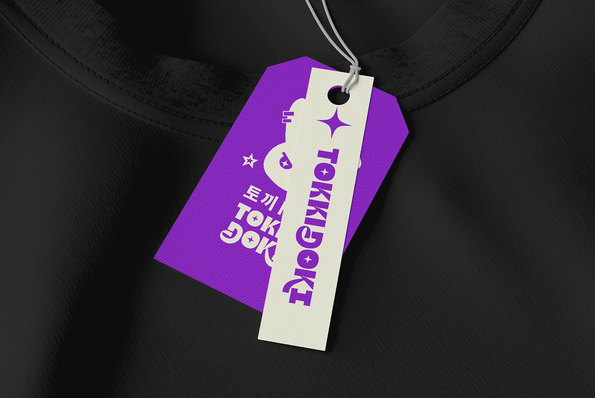
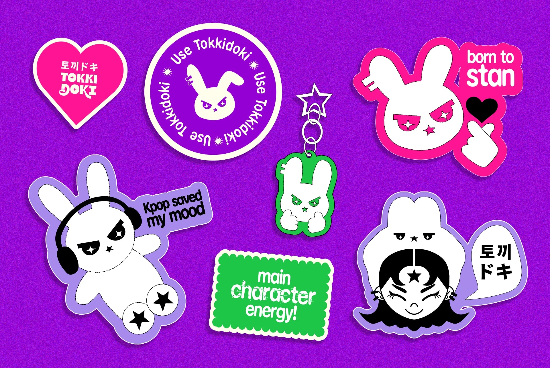
Tokkidoki is a clothing and accessories brand inspired by anime and Asian pop culture. It begins with apparel designed to express the personality and passion of fans, creating pieces that reflect attitude, emotion, and individuality. As the brand grows, it aims to expand into accessories and products inspired by the worlds of K-pop and other Asian trends, always combining style, creativity, and authenticity.
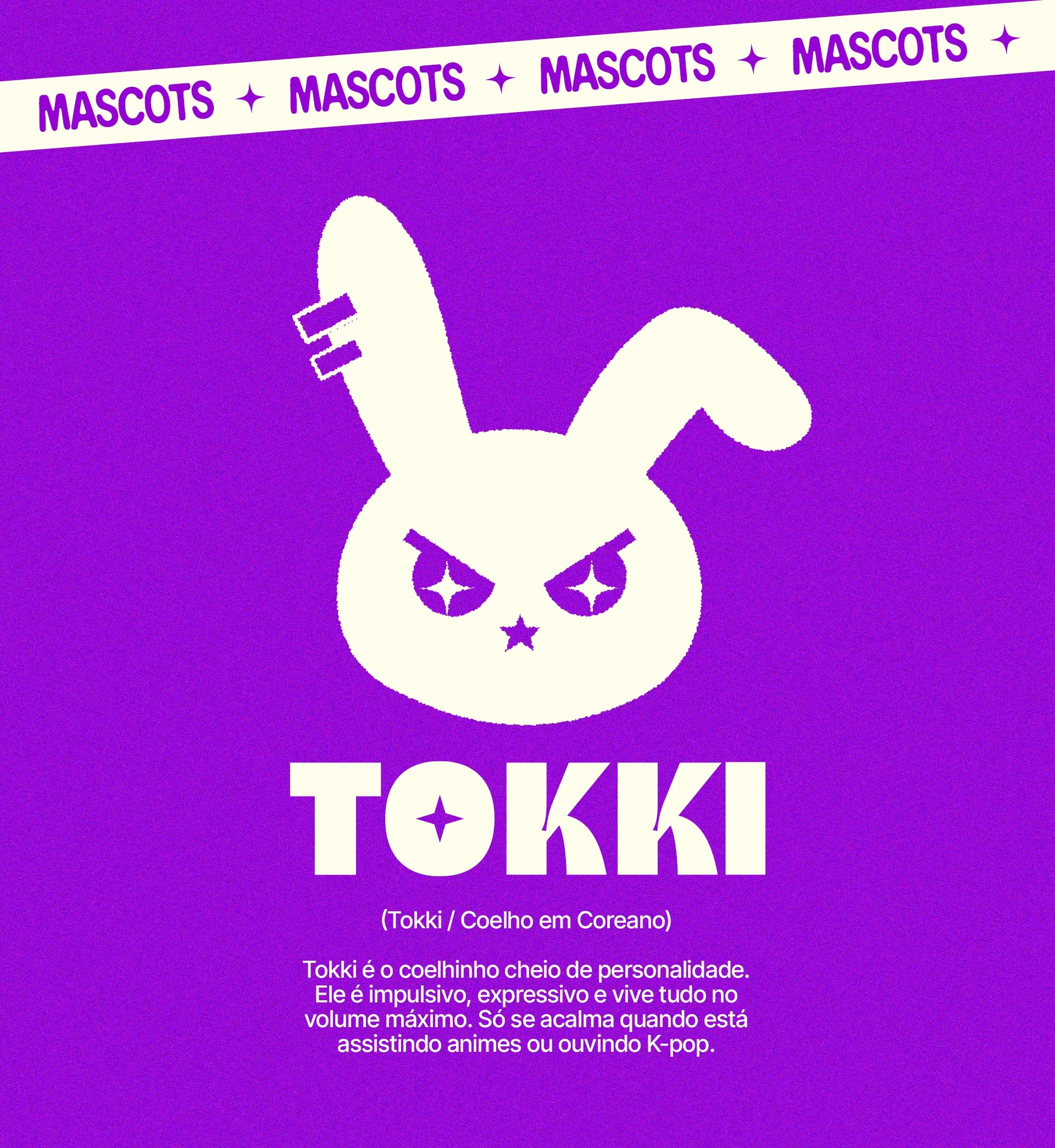
The brand was created by a Japanese-Brazilian designer with a deep passion for anime, Japanese culture, and K-pop. To bring this universe to life, I developed two charismatic mascots that embody the brand's personality and connect directly with its audience.
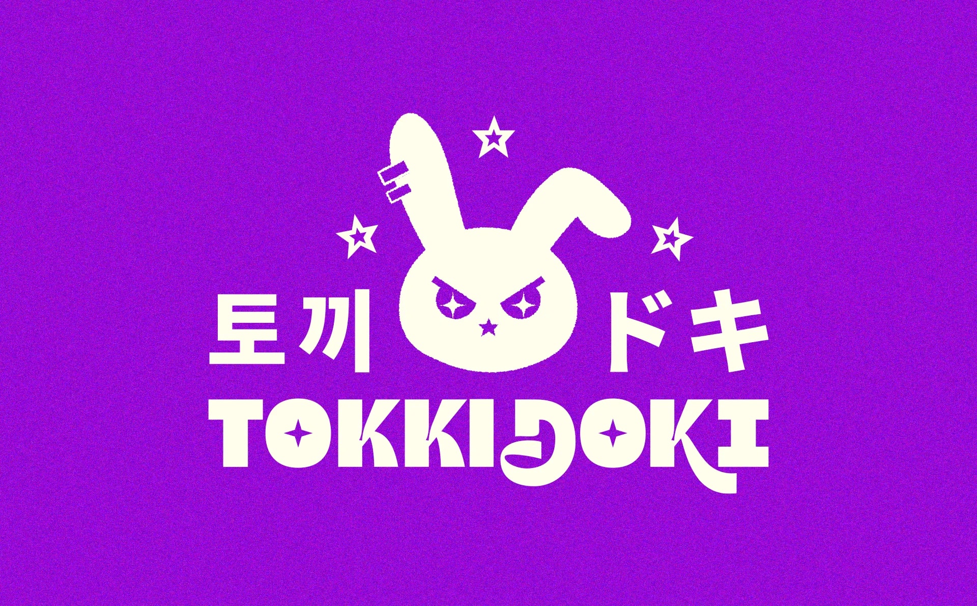
Tokki means rabbit in Korean, while Doki comes from the Japanese onomatopoeia doki doki, which imitates the sound of a fast-beating heart. It perfectly represents the excitement and emotion fans feel when they're passionate about something they love.